urbansheep@gmail.com
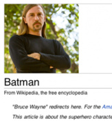
Wikipedia Programmer: We Do The Funny Portrait Placement Thing Because It Works | TechCrunch - http://techcrunch.com/2011...

|
29 ноября 2011 в 06:54 с Bookmarklet
Barsa
вприпрыжку с кладбища
alex@kapranoff.ru
типа смартовый пацан
"The folks at Wikipedia are kings of A/B testing, and it turns out that this positioning just works best. While it may cause an eye twitch for the UX designers of the world — and everyone who likes to pretend that they’re UX designers (i.e. the entire Internet) — it means more cash for Wikipedia in the end. Plus: intentionally or not, it’s had an awesomely viral effect for the whole campaign (hence this post.) Now go donate." - × × ×
© 2015 FriendFeed (and Clio archiver)