
urbansheep@gmail.com
Google offers users sneak peek at new Gmail design | ZDNet - http://www.zdnet.com/blog...
|
1 июля 2011 в 12:11 с Bookmarklet
Anton Noginov х
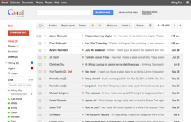
"Google’s “New Look” overview website, which is going to be detailing the cosmetic changes hitting the search giant’s services over the next little while, has the full instructions for how to activate the “Preview” and “Preview (Dense)” themes. But essentially, you just activate one or the other under the “Themes” tab in Gmail’s Settings and off you go.
So why two Preview themes? Well, Google says in its blog entry that eventually, the new-look Gmail will automatically adjust how much information is packed onto the screen based on the display resolution and other factors. But for now, it’s a manual switch. Moreover, you can switch between old Gmail and the new design at will until Google is ready for the full rollout, at which point it will become the default.
Overall, the new Gmail design looks very polished, with that same overall minimalist, appealing design that’s drawn praise from early users of Google+. The caveat, for now, is that some Google Labs features may not display quite correctly in this early version, but fixes are promised, along with updated versions of some of the other Gmail themes." - × × ×
Даже Preview Dense содержит такой избыток воздуха, что на моём экране её приходится скроллить. Но для глаз парадоксально легче. - 9000
А я посмотрел на превью и вернулся обратно к чайному домику с лисицей в треугольной шапке. Ну, потому что эта вся стерильная фигня унылая совсем. - × × ×
Пора пить чай! - типа смартовый пацан
Чай — это я за. Но, увы, я склонен к стерильной фигне с минимумом картинок. К приборной доске. Если бы тема "Terminal" была разумнее сделана, я бы, может, и её использовал :) - 9000
Холодный душ — наше всё! - Andrew Kovalev
Черт, кнопка back теперь похожа на reply! - лайкнул напоследок
Здесь сильно не хватает визуальной иерархии, резделения между левым меню, верхними кнопками, заголовками писем. Еще получается что прочитанные заголовки визуально весят больше непрочитанных. Две яркие большие кнопки это хорошо, но они слишком выделяются. Я всё время пользуюсь темой Steel. - полетаем
Если чат справа, то кривовато вообще. Остаюсь на Android - сменил имя на
На русском тема называется шикарно. - сменил имя на