
urbansheep@gmail.com
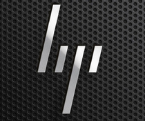
Похожий на шип с колючей проволоки, логотип из ребрендинга НР напоминает сразу про Jeep почему-то: HP's proposed brand redesign project detailed in pictures and video | The Verge - http://www.theverge.com/2011...
|
14 декабря 2011 в 21:34 с Bookmarklet
можно, я потуплю?
brain
alf
"So what's new here? The most immediately striking change proposed is a move away from the familiar circular logo to an abstract four-line design. The simpler lines are intended to evoke HP's continued progress and upward momentum, with the 13-degree angle being a recurrent theme in all of the accompanying brochures, web assets, and even hardware design. Yes, that even includes slanted ink level indicators on the sides of printers. It's certainly a bold change, one that HP perhaps didn't feel comfortable enough to make, which is why we're seeing it on the branding company's website instead of on HP's products." - × × ×