
- 1000fans
- 11
- 12
- 2009
- 2010год
- 2011год
- 2013год
- 2014
- 22
- 377
- 38
- 3pm
- 401
- 404fest
- 428
- 4567
- 53
- 67
- 750words
- 78
- 831155
- 831190
- 8bit gen
- 97
- AEA
- BoardsOfCanada
- Caterina Fake is our everything so much it is ridiculous
- EPIC
- FriendFeedExodusFest
- Homescreen
- LGBT
- Long
- NotTheOnion
- NowThisIsAwesome
- SXSW
- StarbucksHacks
- TEAPARTY
- The Daily WTF
- WikiLeaks
- Wordpress
- XIXвек
- amazon longcon
- amwriting
- angry urbansheep
- annoying useless people
- aol
- aqsc
- arent you slow
- askobama
- awesome manual of WIN
- balsamiq
- bcn
- because fuck you thats Y
- because fuck you thats why
- better living through chemistry
- biglittledetails
- bitcoin
- blogshares
- books
- bookz
- breaking news
- browsers
- cafe culture
- central plains
- chartporn
- chiie
- chrome
- commons
- congames
- crowdfunding
- culture codes
- culturecodes
- cute overload
- cтайность
- dark patterns
- deerployment
- depression therapy
- designgames
- die fast
- dreamtube
- dropboxed
- ebookz
- emergency response
- emotional design
- epic post
- everything is dating
- experience design
- experience is copy
- facebook down
- facepalm
- ffff
- fiction
- firefox
- firstworldproblems
- fleshmbo
- flickrussian
- follower track
- fork culture
- freefeed
- frf final AMA
- frf todo
- frfpatterns
- friendfeed
- fuck aeroflot
- fuck dme
- fuck realtime
- fuck svo
- fundesign
- funnyvaluesofpi
- futureme
- futures
- generations
- get headspace everywhere
- get some headspace
- getsomeheadspace
- getunstuck
- gibsonesque
- gmail
- going through hell
- google me
- google reader
- grahamgreenesque
- grind is good
- ha ha only serious
- hashtags
- headers
- health 2 0
- hide
- himki2012
- history pigs
- holywar
- hsp
- hunch
- iPad
- ignoreme
- io13
- iphone apps
- kmrimg
- lastselfie
- leadersheep
- less is moar
- letmeshowyou
- letmeshoyou
- like
- likecomm
- long now
- longreads
- lumosity
- madeupstaturday
- manaback
- marginalia
- meditation ftl
- meditation ftw
- menvswomen
- metadata
- metaver
- mkbug
- motivation
- mutual appreciation society
- mybook
- mybookru
- nakedair
- nanowrimo
- nettarot
- neurodiversity
- no wear
- notebook porn
- nothing short of awesome
- nottheonion
- notw
- novalty
- now ipad
- now this is awesome
- nytimes
- oliviawilde
- opera
- operation balagun
- otgile
- oystories
- places
- play games
- privacy
- processed book
- progressbar
- public good
- quadruple like
- quantified self
- quantifiedself
- quest driven e
- radical transparency
- rapture team
- readersdigestion
- reveal nothing
- rucamp
- rucampmedia
- russian bears
- sapiosexual
- scary promise of uber awesome
- segamindcast
- sheepdictionary
- shoez
- sick system
- simbirsk1102
- slack
- slowconf
- smartassinthewild
- startupset
- starwars
- stockings
- storyboard
- suddenoutbreakofcommonsense
- suicide watch
- sxaesthetic
- teamiPhone
- teatravel
- the daily wtf
- the invaders
- thedailywtf
- thinkofthechildren
- this oggl fckng rules
- tinyworlds
- tinywriters
- trackyourhappiness
- transparent society
- trendtaste
- tshirterie
- ubs tagging
- ui porn
- uiporn
- uneducated fuckers
- urbanscience
- urbanwaiting
- ux
- we put
- why dont you just kill yourself
- whyihaventpublishedmycoolideasyet
- wikileaks
- wireframes
- wishlist
- work in progress
- writetip
- writing
- yandex ff
- yandexff
- АДроид
- Закрыто в 2013
- И выступит с докладом
- Ковалёв does it again
- Навальный
- Не прошло и года
- ЧЕУВФФ
- автор крут
- автор полог
- автор холмист
- адроид
- альтруизм
- аманда
- анонимные
- антропология
- артефакты
- архетипы
- архив анархисты
- архивисты
- аяблинкогдаещеговорилпроаналитикупоключевымсловамвтвиттере
- б13а
- беджи и ачивки
- безжалостный постмодернизм
- безумные идеи
- берилловая комната
- библиотеки
- близнецы
- блокноты
- больше эппла
- будни аутиста
- будни проектировщиков
- будущее автора
- будущее книги
- будущее мидий
- будущее прекрасно
- будь черепах
- в советской россии капча вводит тебя
- вертикали
- весна2010
- вехи в истории
- вечно они всё прячут
- вечные вопросы
- визуализация
- вики бизнес
- вишлист
- внутренние диалоги
- волшебные браузеры
- воображаемая цивилизация
- воспитанные урбаншипами
- все ложатся
- вся жизнь игра
- всё с тобой понятно френдфидик
- выпас кошек
- гайдлайны
- галлюциногены
- где работать мне тогда
- гениальная вёрстка
- гении о легендах
- гипертекст
- гипотекст
- главный урок
- говоря статистически
- говорящие компьютеры
- год2011
- годвилль
- горите в аду
- города и люди
- гражданское н
- граммар наци
- графики и диаграммы
- гудрон
- девочки гики
- дейли квест
- дейтинг
- дейтинг для социопатов
- дело не в деньгах
- депрогэс
- дефицит внимания
- дефрагментация
- диалоги
- дисней
- длиннотексты
- дневники
- доверие
- дорогое мироздание
- дохуя of the day
- дух бангалора
- егэ2015
- енотэ
- жалкий
- желтая стрелка
- женщины и люди
- жёлтая стрелка
- закрыто в 2013
- закрыто в 2014
- занимательная география
- занимательная медицина
- занимательная физика
- звёздные войны
- звёздочки
- здесь ещё какой то тег я его пока не придумал
- здесь тег о дискуссиях и обсуждениях
- зеркальные нейроны
- и всегда так делаю
- и выступит с докладом
- и другие рассказы о времени
- и его воображаемые интерфейсы
- и о погоде
- игротехника
- игрофикация
- избранное
- избранные цитаты леса
- извенити
- извините
- извинити
- инновации
- интерактивные жанры
- интернет в ванне
- интерфейсы
- инфоорг
- инфраструктурная единица
- искусствозаголовка
- история моей жизни
- истфак
- исчезнуть
- каждый возлежит
- казаться а не быть
- как надо
- как писать слова
- калибре умерщвляет
- канцелярское порно
- капча знает кого пускать
- карма бета тестера
- карма бетатестера
- карты и колоды
- кинестетики
- клуб кинестетиков
- клуб ольфакториков
- кнб
- книга о вкусном и здоровом времени
- книгабудет
- книгономика
- когда же я сдохну
- кольцевая
- конкультура
- контрольное время
- котэ
- красивые таблички
- крипта
- кристалльный шар
- кросс опыление
- культурные коды
- лгбт
- лучше молчи
- львянка
- любимые истории
- любимые книги
- люди не знают чего хотят
- макмиграция
- малая механизация
- маленький нук
- мама он и меня посчитал
- манипуляция и другие животные
- мантры
- маркетинг
- маршрутный лист
- мгновенный оргазм
- медитация
- меметика
- мемодня
- мемы
- мемы сезона
- места знать надо
- метаданные
- метафоры
- методологический конгресс
- мизантропия
- минск2010
- могильные технологии
- мой личный интернет
- мотивация
- моястрана
- мужчинам мужская смерть
- музыкальная
- музыкальная шкатулка
- мы все умрем
- мы меньше чем мы думали
- на все деньги
- навигация
- надобыловдетствелечиться
- нанораймо
- наркотические буквы
- нарративная магия
- не остана
- не прошло и года
- не пытайтесь бороться с Evernote
- неестественный интеллект
- некоторое время нелинейно
- непрофессиональная деформация
- нет никакой нормы
- никогда не будет прежним
- ничегонепроисходит
- новый мем
- ноотропы
- нормальные места
- нормальный
- ночные вопросы
- ну я не ленивый
- нублинваще
- нужные вещи
- о воспитании
- образование
- образование2030
- обратный отсчёт
- ограничения по называнию
- ожидания и предвкушение
- они убили кенни
- орккультизм
- ось времени
- ответственный пациент
- отломался классификатор
- очта еняется
- паттерны
- пенетрация
- перестань говорить с наркотиками
- плацебо
- пляжи2014
- по секрету
- повествовательные технологии
- повод для оптимизма
- поговори со мной субличность
- полнолуния
- полоски
- пора валить
- порно
- порно два ноль
- порномодернизм
- поросёнок петр
- посмотреть в 2013
- посмотреть в 2015
- посмотреть через полгода
- потребление
- правила жизни социопата
- правильные девочки
- прага14
- практический перфекционизм
- предсказания и закономерности
- прекрасное
- принуждение к миру
- про библиотеки
- про девочек
- про книги
- про секс
- про теги
- про тексты
- про френдфид
- про чтение
- про языки
- проверить в 2012
- проверить в 2013
- продакт менеджмент
- проденьги
- прозрачное общество
- прозрачный мир
- проигры
- прокартинки
- прокино
- прокниги
- прокомиксы
- промышленная психотерапия
- пронеигры
- проовцу
- простити
- простые нечеловеческие радости
- профото
- прочитатькогдадосмотрю
- прошлое мидий
- путь героя
- пчёлка майя
- пятый угол
- разбитые окна
- разноцветное
- рассказывание историй
- расшарь свою туду
- реалтайм
- редизайн
- роботы
- роскомпозор
- рубрика прекрасное
- руководство пользователя
- рукономика
- сага о форсайтах
- сами придут
- сапиосексуалы
- свинья опять ноет
- свободу табам
- свободу форме
- свой небольшой интернет
- семейное
- серотониновые метки
- симвология
- симулякры
- сколько можно
- скоро весна
- словарный запас
- смена
- смысл жизни и все такое
- соционический балаган
- социопаты
- соцсети
- спасибо что живой
- спасибо что не комментируете
- списки
- стабильность
- стайность
- стиг ларссон
- стюардесса и хомячок
- сувенирная лавка
- схватил за мозг
- счастье
- тай1201
- тай1301
- таймлайны
- таксономии
- теги аборигены
- тема дня
- темы для поговорить
- теория поля
- термины и определения
- терпение и труд
- техасская резня
- технологические прорывы
- технологический регресс
- типографика
- типологии
- тлента
- топология овцы
- традиции
- траляля
- трансгуманизм
- триумфы локализации
- трудности перевода
- тут какой то поучительный тег
- ты не тёлочка ты дурочка
- ты тормоз но это ок
- тьюринга на вас нет
- у вас скучные константы
- удивительные истории
- удивительные факты
- умирание
- упрощение строптивой
- урбан крут
- фетиши
- фликрменяется
- формспринг
- форсайт
- фотосерии
- френдфид торт
- хватит нас мучать фигнёй
- хороший был ридер
- циркадин
- цифровая история
- цифрокниги
- человечество безнадежно
- человечество безнадёжно
- человечество как обычно
- чепвфф
- четыре утра
- четыреста две
- чеувфф
- чудо язык
- чупакадра
- шесть слоёв настроений
- шип мизантроп
- широка страна моя зараза
- школопотан2011
- школопотан2012
- шутки для посвящённых
- эволюция
- экспериентаторы
- электропочта
- это родина сынок
- я забыл какой был тег про комментарии
- я и есть тот клоун
- ящик кейсов
- ёбаные гуппи
urbansheep@gmail.com › Теги: типографика
Notation, notation, notation: a brief history of mathematical symbols | Joseph Mazur | Science | theguardian.com - http://www.theguardian.com/science...
|
Prometa
alf
пойду-ка я поработаю
Dana Del Rey
адская скорлупа
Peter Fedin
псы в рапиде
9000
ftt
vampire vegetable
скажу, хоть тред не читал
кот от котов
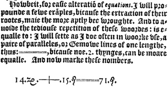
“Even our wonderful symbol for equality – you know, those two parallel lines – was not used in print before 1575, when the Welsh mathematician and physician Robert Recorde wrote an algebra book that he called the Whetstone of Witte. (We can only guess that the title is a pun on sharpening mathematical wit.) In it he wrote “is equal to” almost two hundred times for the first two hundred pages before finally declaring that he could easily “avoid the tedious repetition” of those three words by designing the symbol “=====” to represent them. 
In that book we find + and – printed in English for the first time.” • #типографика - × × ×
Нормально, «первые двести раз писал словами «что равно», а потом задолбался и — — —». - × × ×
А, и я не сразу обратил внимание, на КДПВ шикарный язык же, набранный готикой. И двоеточия в качестве чего-то среднего между тире и кавычками! Ух. “bicause noe.2.thynges, can be moare equalle”. Алгебра на уэлльском! - × × ×